
This post was originally published on this site.
December 3, 2025
This newsletter issue analyzes what has become known as “the debasement trade” to see where it is true, and where it is misleading.
This issue is supported by YCharts, which I use for both stock-specific and macroeconomic research and visualization. You can access a free trial here.
The Debasement Trade
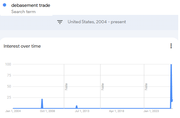
Back on October 9th, the Guardian ran a piece about the so-called debasement trade. Here’s how the article started:
Investors are piling into assets such as gold, bitcoin and shares amid worries about government debt, central bank independence, and the weakness of major currencies such as the dollar. The trade has even been given a moniker: the “debasement trade”.
Earlier that week, as referenced in that Guardian article, Ken Griffin of Citadel Securities (the largest market-maker on major US stock exchanges) had discussed it:
Ken Griffin, the founder and chief executive of the hedge fund Citadel, said this week that investors were looking for ways to “effectively de-dollarise and de-risk their portfolios vis-a-vis US sovereign risk”.
“Inflation is substantially above target and substantially above target in all forecasts for next year. And it’s part of the reason the dollar’s depreciated by about 10% in the first half of this year. It’s the single biggest decline in the US dollar in six months, in 50 years,” Griffin told the Citadel Securities future of global markets conference.
Until October 9th, the term wasn’t materially present in Google Trends, and then it popped. It quickly made its rounds across financial media and social media. Gold was breaking above $4,000/oz for the first time, and bitcoin was near its highs at around $120,000.
Of course, some of us that have been talking about currency debasement for a while found the sudden attention on the subject humorous.
Highlighting the risks of sovereign bonds has been one of my main talking points since 2019 with articles such as Are We in a Bond Bubble? (July 2019), The Subtle Risks of Treasury Bonds (Feb 2020), Treasury Market Dissonance (Aug 2020), Fiscal-Driven Inflation (May 2021), The Long-Term Fiscal Spiral (Nov 2022), Fiscal Dominance (July 2023), Why Nothing Stops this Fiscal Train (Sept 2024), and many more.
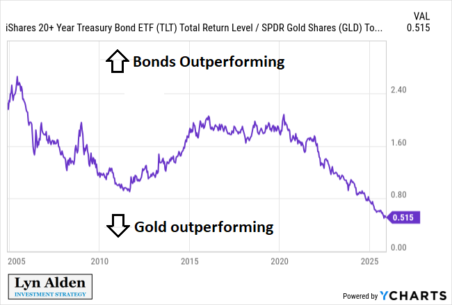
Sovereign bonds went on to have basically their worst 5-year period of performance ever from 2020 through 2025. They’re down nominally, and on an inflation-adjusted basis they’re even more negative.
Simply avoiding long-duration bonds and owning almost anything else has been one of the major tailwinds of this newsletter’s model portfolio. Stocks, gold, bitcoin, houses, art, whatever. They’ve all been winners relative to bonds at different speeds.
Narratives tend to follow price. Back in 2019 and 2020, people were talking about how “inflation is dead”, and there was $18 trillion worth of negative-yielding bonds in the world that institutional investors were quite comfortable holding. Fast forward to 2025, after many years of high inflation and devastating losses in bonds, and gold going up 3x and bitcoin going up 10x, the risk of sovereign bonds is now widely being talked about by major investment banks and major financial publications.
Ironically, as unattractive as bonds are, their rate of underperformance relative to stocks is likely to slow now. While I continue to expect bonds to lose purchasing power, it likely won’t be as rapid as the prior five years have been, and it’s less of an obvious “short bonds, long stocks” trade going forward. And yet that’s the current narrative, because it’s the trailing price behavior.
In reality, we’ve been in a five-decade debasement trade, not just a recent one.

But as the next section will show, some of those debasement aspects are likely to change, right when everyone is talking about it.
Five Decades of Debasement
The modern debasement trade began in the first half of the 20th century when governments began to gradually decouple their commercial banks from gold via an increasing layer of central bank abstraction and reduced currency-gold price pegs.
But it really kicked into high-gear in the second half of the 20th century when they decoupled from any sort of currency-gold price peg entirely.
Here are some charts from Broken Money:
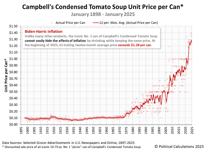
One of the more straightforward ways to show the debasement is via the price of Campbell’s tomato soup. Rather than relying on a complex set of estimates and substitutions, it’s just a history record of what the same can of soup cost over time. The pivot point is pretty clear:
And then a bit later, starting from around 1980, the US kicked off a 40-year trend of lower interest rates from a very high level. This kept reducing the hurdle rate for valuing companies and other assets, resulting in structurally rising valuations. It also reduced the cost of borrowing to buy those assets, which incentivized taking out leverage and buying those assets.
As a result, total household net worth relative to GDP and relative to household disposable income kept climbing:
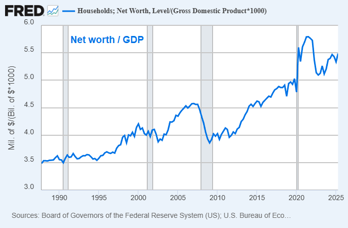
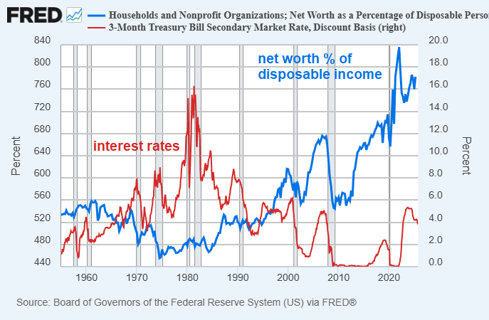
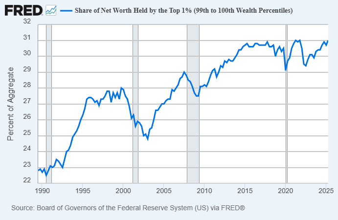
Of course, that net worth was rather concentrated. While nominal wealth generally went up across the board (in a diminishing unit of account), the top 1% went from owning 23% of the country’s household net worth in 1990 to 31% of the country’s net worth today. Those who held assets, and especially those who held conservatively leveraged assets (i.e. long assets, short fiat currency), had a structural tailwind in their favor relative to those who relied primarily on labor.
What’s different now is that 40-year cycle of ever-lower interest rates is over. Interest rates might not go up, but they’re unlikely to keep reaching lower-lows and lower-highs as they were before, especially since they had literally gone to zero. Asset prices no longer have that tailwind of ever-lower rates behind them.
While many individual assets will do well in the years ahead, I am doubtful that household net worth will keep smoothly rising relative to disposable income, and that the CAPE ratio for equities will keep rising far beyond levels seen only in the dotcom bubble. I think there’s a good chance that the structural peak in the ratio of household net worth to disposable is already in, and that the structural peak in the CAPE will be sometime soon. There are some things that could cause me to change my mind on that, but that’s my current perspective.
Now, to be clear, I still expect debasement to continue. And a metric I like to look at is interest-adjusted debasement. In other words, if money supply is growing by 7% per year, there’s a pretty big difference if an investor can get 1% on their 10-year bonds or 5% on their 10-year bonds.
-If you get only 1% on your bonds in that scenario, then your interest-adjusted debasement is 6% per year. Money supply is going up, but your money is earning only a very small share of those new units. You have an incentive to buy almost anything else.
-On the other hand, if you are getting 5% on your bonds in that scenario, then your interest-adjusted debasement is 2% per year, which is not that different from gold’s effective debasement rate via mining and storage/security fees. At this rate, it’s more of a close comparison.
This following chart shows the interest rate on 10-year bonds minus the annual growth rate of the US broad money supply. The lower it is, the faster the interest-adjusted debasement is occurring for bondholders:
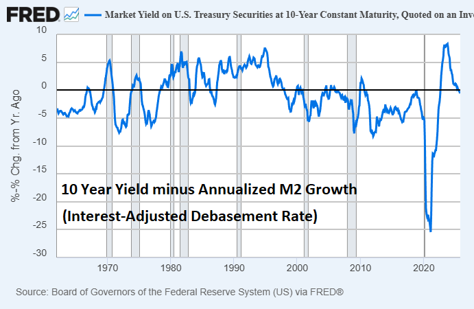
After a long stretch of hawkish monetary policy in the 1980s and early 1990s (i.e. not a bad time to own bonds), this metric turned structurally negative from the late 1990s onwards. The 2010s in particular had a rather persistent -5% average interest-adjusted debasement rate for a while, which is pretty huge.
Then, the years 2020 and 2021 were utterly massive for debasement, briefly peaking at -25% for this metric. By 2022, the fiscal injections slowed down and the Fed tried to tighten monetary policy. This was effective for a period of time, with a temporarily declining money supply and high interest rates. However, that began reversing course, and recently the metric turned negative again.
Going forward, I expect money supply to generally resume growing at a faster year-over-year percentage rate than the interest rate on government securities, meaning this metric will be negative more often than not. However, it’s likely to spend a lot of time only moderately negative.
Thus, my base case is that we will find ourselves in a structural environment where debasement keeps occurring, but absolute hurdle rates and costs of capital are no longer declining (i.e. no more lower-lows in interest rates), and thus valuations for equities, houses, and other assets will have less of a structural tailwind behind them.
The Gradual Print
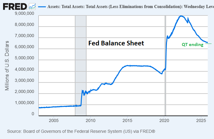
Since 2022, the Federal Reserve has been reducing its balance sheet from extraordinarily high post-2021 levels.
However, much like September 2019 when they ended their prior period of balance sheet reduction, they are now running into liquidity shortages and price spikes in repo markets.
As a result, Fed repo activity has picked up (a temporary liquidity injection), the interest rate spread between the secure overnight financing rate and the interest rate on bank reserves (SOFR-IORB) has turned positive, and the Fed has ended its balance sheet reduction.
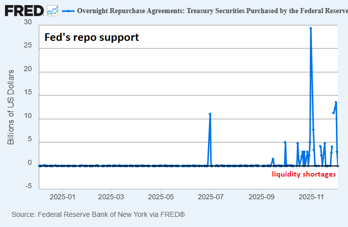
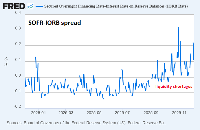
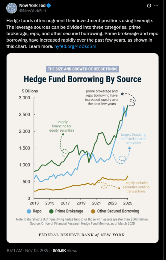
Considering that hedge funds use a ton of repo financing for leveraging up their assets, and stress in one funding rate tends to lead to stress in other funding rates, this has potentially contributed to wobbly markets as of late.
Fed officials have recently discussed going back to balance sheet expansion. Notably, they’ve been expecting that for the past couple of years. I covered the NY Fed’s report on the topic back in my April 28, 2024 premium report:
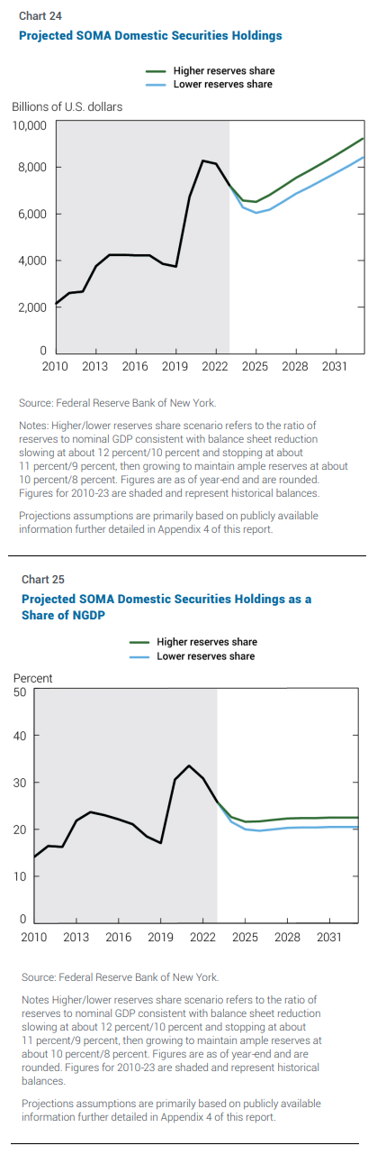
A couple weeks ago, the New York Fed released their 2023 annual report for open market operations. Notably, this includes their projections for what the Federal Reserve’s balance sheet will look like in the years ahead.
They expect a tapering of the rate of balance sheet reduction in 2024, and then a bottoming and resumption in growth in 2025, at a rate that is in line with the growth of nominal GDP:
And specifically, they expect a reduction in mortgage-backed securities as a share of holdings, and an increase in U.S. Treasury securities as a share of holdings:
While the actual outcome will likely be bumpier and higher than forward expectations (both the Fed and the Congressional Budget Office always assume smooth growth with no recessions ever in their projections), I think these overall projections make sense as a middle range or lower bound, and are in line with my expectations.
-April 28, 2024 premium report
Here in late 2025, after tapering their rate of balance sheet reduction during the past 18 months, repo stress has led the Fed to announce the end of balance sheet reduction. When they will resume balance sheet expansion remains to be seen, but 2026 seems likely.
Additionally, policymakers finalized the decision to ease the enhanced supplementary leverage ratio for banks, which around the margins can let them buy more treasuries with the same amount of capital.
From here, the Fed has a few levers they could pull to facilitate liquidity. They could go back to gradual balance sheet expansion, they could further tweak the supplementary leverage ratio for commercial banks to avoid counting banks’ treasuries and reserves against them (as Fed Governor Miran has proposed), or they could make certain other operational or regulatory changes.
Notably, the Fed has intended (and still intends) to let mortgage-backed securities mature off its balance sheet even as they shift toward accumulating more treasuries. And I think that’s a trend we’ll see more of: the Fed focusing on supporting core markets (i.e. ensuring both Treasury and repo markets are liquid and stable) and letting more pain occur in other non-core markets (e.g. housing, equities, private equity and private credit, etc).
With economic indicators slowing (other than AI capex and fiscal transfers), some people expect that a massive surge of money-printing is coming.
However, as a base case I instead expect a more gradual increase in the Fed’s balance sheet after a period of flatness. Certain shocks or events could lead me to adjust that view, but with the visibility I have now, that’s what I think is the highest probability outcome. We could perhaps call this the “The Gradual Print”, which is a friendly play on Larry Lepard’s book, The Big Print and a reference to an interview I did with Natalie Brunell back in September.

To the extent that this gradual print scenario plays out, we should expect somewhat of a stimulus floor on asset prices and nominal GDP in general, but not to an excessive degree. The hurdle rate and costs of capital won’t be structurally decreasing, which takes some wind out of the sails of structurally higher asset valuations (e.g. price-to-earnings ratios of equities and price-to-income ratios of houses relative to their occupants). The unit of account will keep debasing, because nothing stops that train, but overpriced assets can indeed still settle down for years even as other assets continue to rise.
A number of variables ahead can significantly impact the economy and markets. The Supreme Court’s upcoming decision on emergency-power tariffs, the Fed’s upcoming decisions around rates and balance sheet activities, and similar decisions in Europe, China, Japan, and elsewhere.
Overall, I think liquidity indicators are likely to be decent for the next year, but valuations of assets matter when it comes to managing risk and reward. On that front, a great number of assets, especially in the United States, are pricey.
Portfolio Updates
I have several investment accounts, and I provide updates on my asset allocation and investment selections for some of the portfolios in each newsletter issue every six weeks.
These portfolios include the model portfolio account specifically for this newsletter and my relatively passive indexed retirement account. Members of my premium research service also have access to three additional model portfolios and my other holdings, with more frequent updates.
M1 Finance Newsletter Portfolio
I started this account in September 2018 with $10k of new capital, and I dollar-cost average in over time.
It’s one of my smallest accounts, but the goal is for the portfolio to be accessible and to show newsletter readers my best representation of where I think value is in the market. It’s a low-turnover multi-asset globally diversified portfolio that focuses on liquid investments and is scalable to virtually any size.
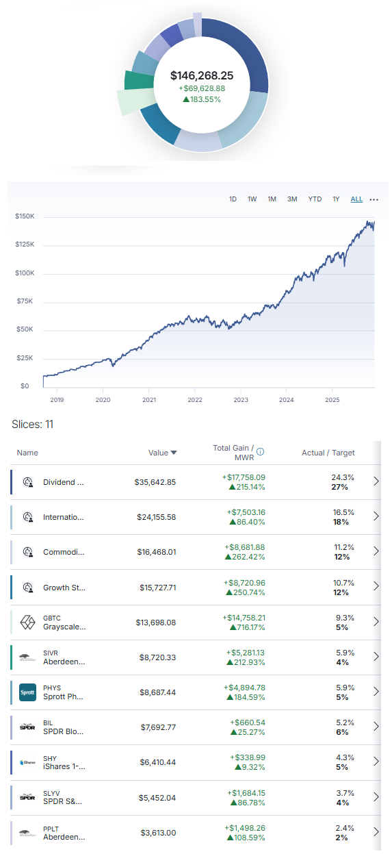
And here’s the breakdown of the holdings in those slices:
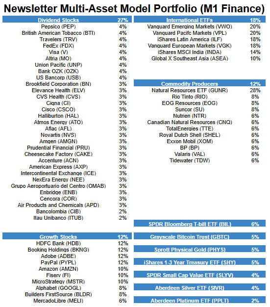
Changes since the previous issue:
- Sell TSM and AMD.
- Buy ACN and PYPL.
Other Model Portfolios and Accounts
I have three other real-money model portfolios that I share within my premium research service, including:
- Fortress Income Portfolio
- ETF-Only Portfolio
- No Limits Portfolio
Plus, I have personal accounts at Fidelity and Schwab, and I share those within the service as well. Premium reports come out every two weeks.
Final Thoughts: Weak Sentiment
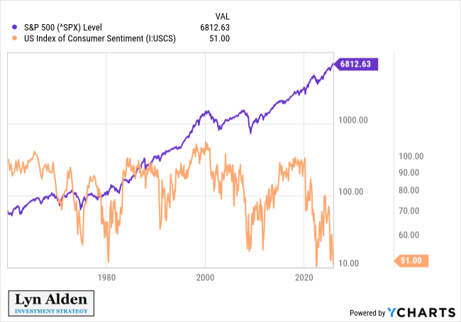
The University of Michigan has been publishing national consumer sentiment metrics for decades.
Current consumer sentiment numbers are near record lows, normally seen at the bottom of severe recessions, despite the fact that there is no current NBER-defined recession, and the stock market is near record highs.
It’s the most extreme divergence between consumer sentiment and the stock market in over 40 years.
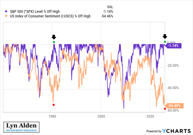
This next version of the chart shows the same graph, but it’s measured in terms of how far they are off from their highs. We have look back at the early 1980s to find a similarly low sentiment reading while stocks were near their highs:
This divergence is a common symptom of fiscal dominance and/or inflation.
It occurs similarly in emerging market recessions, where the economy is broadly weak but there’s enough debasement going on to push their stock prices up in their own currency. Usually in those environments, their stocks are doing poorly in dollar or gold terms, but doing well relative to the local currency.
The United States, when it operates in a state of fiscal dominance, is basically “emerging market lite”. In other words, it displays some emerging market characteristics, albeit wrapped in the less extreme wrapper of a developed market.
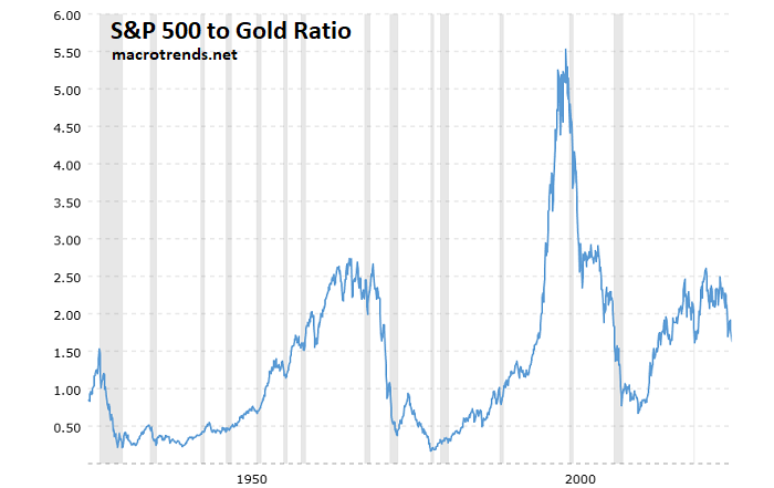
And so, for example, we see the S&P 500 doing fine in dollar terms but rolling over relative to gold for several years now, in what is becoming the fourth big stock-vs-gold bear market in modern US financial history. Basically, the S&P 500 to gold ratio over the past 5+ years looks roughly like we’d expect in a weak consumer sentiment environment, because that effectively filters out the dollar’s debasement from the equation:
The main takeaway from this piece is that valuations do matter here, and it’s not an easy environment for assets to go up substantially in real purchasing power terms. Picking the right assets can be the difference between a “lost decade” in markets, and a decade of decent returns.
Best regards,